
Systemwide Human Resources
Accessibility
Training and Resources
- UCOP accessibility virtual office hours: available only for UCOP staff; connect with an accessibility expert to explore and answer any questions you may have
- Accessible Color Contrast training: guides learners through the principles, practices and tools involved in ensuring their use of color complies with contrast standards, while providing numerous opportunities for them to practice the exact skills they'll use when evaluating and implementing accessible color contrast in their own work
- Creating Accessible PDFs: this LinkedIn Learning course, taught by Chad Chelius, covers much of what you need to know to start producing accessible Word, PowerPoint and PDF documents
- WebAIM.org: a fantastic repository of accessibility information, offering both "quick reference" guidance and detailed explorations of certain topics
- The eCourse Accessibility Checklist provides standards and best practices for eCourse accessibility, as well as additional guidance for creating accessible eCourses using Articulate Storyline 360
- The Rise Accessibility Best Practices web page provides guidance and recommendations for optimizing accessibility within Rise eCourses
- The comprehensive Word-to-PDF and PDF Accessibility Guide (pdf) provides checklists and step-by-step guidance for manually reviewing and improving the accessibility of Word and PDF documents
- Note: this guide is written to Word 2016; in general, much of the guide's information is still relevant to Word 365, but there are some changes to accessibility-related behavior in Word 365 the guide doesn't capture (see the Creating Accessible PDFs LinkedIn Learning course linked above for more current Word accessibility guidance)
- The How to Develop Accessible Learning Content session from UC's 2023 Global Accessibility Awareness Day (GAAD) webinar, Your Path to Accessibility, provides accessibility guidance pertaining to a number of eLearning formats, including live presentations and PowerPoint
- The Rich Text Editors: Maintaining Accessibility session from UC's 2022 GAAD webinar, Accessibility Demystified, provides guidance on working accessibly in rich text editors, which are commonly used in learning management systems (LMSs), such as Canvas, Blackboard and Moodle
- Much of the session's guidance is also applicable to working in other content editing environments/programs, like Microsoft Word and Google Docs
- And the session's supplemental slide deck, Rich Text Editors: Maintaining Accessibility (pptx), opens by sharing guidance on working accessibly in PowerPoint
- The UC Electronic Accessibility Committee offers additional resources that may assist in making digital learning content more accessible
You can also reference the Web Content Accessibility Guidelines (WCAG) 2.1, which the UC IT Accessibility policy (pdf) and recently enacted federal laws have adopted as the technical standards that define whether digital content is considered accessible or not: specifically, the policy and laws adopt WCAG 2.1 AA (meaning A & AA SC must be met).
Simple Steps for Better eLearning Accessibility
Accessibility can be challenging at times. Some concepts are more difficult to understand; others are more difficult to apply.
While we encourage you reference the resources above for a more comprehensive picture of accessibility requirements and how to achieve them, we also wanted to offer here some of the accessibility best practices that are easiest to understand and apply, so you can get a jump start on offering accessibility benefits to your audiences.
Prioritize color contrast compliance
Describe (in video audio or presentation talking points) important information that is being presented visually
This piece of advice may have the smallest cost to biggest benefit ratio of anything we do in accessibility: i.e., it’s really easy to verbally describe visuals in videos, but if we don’t, there’s a high resource cost to making those videos sufficiently accessible (as captured and described by WCAG SC 1.2.5 Audio Description (Prerecorded)).

Don’t rely on audience members’ ability to see visuals in order to follow along and understand the points you're making.
For example, if you’re giving a presentation or recording a lecture and you show the slide to the right…
It wouldn’t suffice to only say, “As you can see, disabilities are more common than you may think," because audience members who couldn’t see the slide details would be deprived access to the visual information that supports what you’re saying.
You would need to also say (in some way, shape or form), “According to CDC research, 26% of Americans overall, college aged and older, experience a disability; 5% have vision disabilities; 6% have hearing disabilities; 11% have cognitive disabilities; 14% have physical, motor, mobility disabilities.”
Accompany videos and eCourse slides containing audio with captions
Give non-decorative images succinct, descriptive alt text; hide decorative images from assistive technologies
Text can rarely be considered decorative
Content needs to be presented to assistive technologies in the order that best facilitates comprehension and engagement
In text documents (.doc, .docx, .txt and .rtf files, Google Docs, etc.) and in HTML environments, the order in which assistive technologies encounter and read content tends to match the order in which content is arranged on a page, so no “behind-the-scenes” re-ordering is necessary.
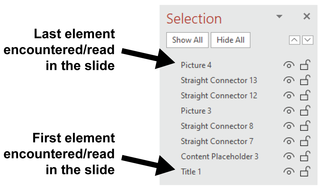
In PowerPoint, the order in which assistive technologies encounter and read content is determined by the order of elements in the Selection pane (accessed through the Format ribbon or Arrange drop menu).
Elements in the Selection pane are encountered/read bottom to top: as in, the element that is lowest in the Selection pane is the first element in the slide that assistive technologies will encounter/read; the element that is highest in the Selection pane is the last element in the slide that assistive technologies will encounter/read.
You may need to manually review, and possibly edit, the order of elements in each slide.
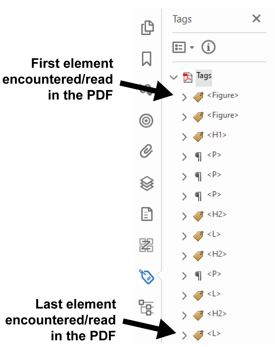
In PDFs, the order in which assistive technologies encounter and read content is determined by the order of tags in Adobe Acrobat Pro’s Tags pane. Note: the Tags pane is not available in Adobe Acrobat Reader; contact your location’s IT Services if you need Adobe Acrobat Pro.
The Tags pane is read top to bottom: as in, elements that are higher in the Tags pane will be encountered and read before elements that are lower in the Tags pane.
You may need to manually review and edit the order of elements in the Tags pane, especially if you did not actively manage reading order in the program used to produce the PDF.
Additionally, be aware, if you have Adobe Acrobat Pro’s Reading Order tool open, with the “Show page content groups” and “Page content order” settings assigned, the numbers you see within the PDF’s body DO NOT indicate reading order (they indicate Reflow order). Reading order is visible and editable only through the Tags pane.
Do not pack content too closely together; spacing and "chunking" are your friends
Use tables appropriately and enhance their accessibility
Do not use tables for layout purposes: that is, do not use tables for the purpose of achieving a specific visual design. Tables should only be used to present tabular data or information. Further below is an example of a table being used (inappropriately) for layout purposes, along with an informal test you can use for assessing if you're using tables properly or not.
Making tables with merged/spanned cells accessible can be a challenge — it can't be done natively in Microsoft Word and it requires additional work and expertise in PDF and HTML environments — so unless you're experienced with doing that work, it's generally recommended that you avoid using merged or spanned cells in tables..
A table's first row is commonly used to label what is in each column, and similarly, the first column is often used to label what is in each row. Program these "label cells" in the first row and/or column as table header cells; doing so will provide screen reader users with incredibly useful reminders of what each cell's data or information represents.
In Microsoft Office products, use the Header Row or Repeat as Header Row table settings to program a table's first row as table header cells; use the First Column table setting to program a table's first column as table header cells.
In HTML environments, follow the detailed creating accessible tables guidance provided by WebAIM.com.
Table for Layout Purposes and the 3c's Test
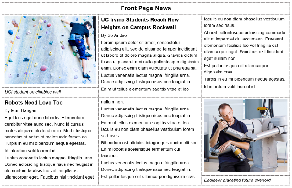
The table above is being used (inappropriately) for the purpose of achieving a newspaper-like visual design, not for the purpose of presenting tabular data or information.
The 3c's test can help you assess whether you're using tables appropriately or not. The 3c's are: comparing and/or connecting, consistently.
If you're using table structure to compare and/or connect data/information in each row and/or column AND you're doing so with absolute consistency — e.g., the same number of cells in each column and row; the same type of data/information in each column and/or row; the same order of data/information in each column and/or row — then you're probably using the table appropriately, to present tabular data or information.
But if you're not using table structure to compare and/or connect data/information OR you're doing so without sufficient consistency, then you're probably using a table for layout purposes or introducing another table accessibility issue.
The example table further above fails the 3c's test because:
It isn't using table structure to compare data/information.
And it isn't using table structure to connect information (we can tell because each cell's contents are arbitrarily determined by what fits in the cell, rather than a purposeful attempt to connect specific pieces of information), so it already fails the 3c's test.
And there is no consistency in terms of what is in each column and row, so it fails the 3c's test in that regard as well: there are a different number of cells in different columns; there are different parts of each article in each column; and related to that, there is a different order of article parts in each row.