Electronic Accessibility
Links and Buttons in Storyline
Last updated: 1/26/2026
Links in Storyline
To create a link in Storyline, you must select the text you wish to turn into a link and then use one of the hyperlink features. These include:
- Insert ribbon > Hyperlink
- Right-click on selected text and choose Hyperlink option
- Ctrl + K keyboard shortcut
You cannot create a link by selecting an element and assigning it an "Open URL/file when user clicks" trigger. Even though properly-created links present as these kinds of triggers in the Triggers pane, attempting to create a link in this manner will instead result in the element being structurally recognized as a button by assistive technologies.
Storyline does not currently support programming images, text boxes, shapes or buttons as links.
Editing links
In certain older versions of Storyline, attempting to edit links directly within their text boxes may cause programming errors in a published eCourse, such as individual links being separated into multiple links or empty link tags being left within slides.
While this behavior has been observed less frequently with newer Storyline versions, it may still be safest to edit links and link text within the Triggers pane or Edit Trigger panel, as these approaches have not been found to produce the same programming errors.
If you encounter an error you cannot resolve stemming from editing a link directly within its text box, you may need to re-create the text box and link from scratch to fully resolve the issue.
Buttons in Storyline
Any element in Storyline that has been given a When user clicks trigger will be structurally recognized as a button*. So, if you're describing such an element to learners, describe it as a button to match how screen readers and other assistive technologies will interpret it; if you instead call it a link, these users may become confused or fail to recognize the element.
*The one exception to this is that properly-created links will present, in the Triggers pane, as When user clicks triggers.
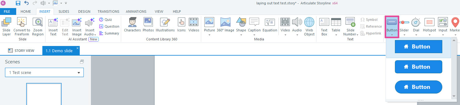
Insert > Button
While many elements in Storyline can be turned into a button by applying a When user clicks trigger, Storyline also offers a category of elements it specifically calls "buttons." These can be added through the Button menu in the Insert ribbon.
While these buttons offer certain unique advantages, such as the ability to include icons, they also have other unique characteristics it's worth being aware of, some of which are accessibility related:
- Buttons are automatically pre-populated with multiple, built-in states, such as Hover, Down, Visited and Disabled; if you do not want learners to encounter certain of those states, you must manually delete them
- Those states will be pre-populated with alt text that differs from the button's base alt text — that is, its alt text when viewed outside of Edit States mode; this means:
- Changing the button's base alt text may not automatically change the alt text for the pre-populated states, as once a state has been given different alt text than the element's base alt text (even if it simply starts with different alt text), the two alt text fields will often remain permanently disconnected
- You will likely have to manually assign and maintain the alt text for each pre-populated state
- Two exceptions:
- Even though a button's base alt text and Normal state alt text may appear different at first, they are likely not disconnected and cannot be disconnected (except in certain older versions of Storyline)
- If you give a button button text before editing its base alt text or a state's alt text, the button text will automatically be assigned as the button's base alt text and alt text for each button state
- While the following behavior has not yet been observed or reported with the newest version of Storyline, with past Storyline versions, it has been observed that the built-in states — particularly Selected and Visited — created inexplicable conflicts with other accessibility related programming, where buttons would not reliably enter the correct states or convey the correct alt text
Bottom line: if you use these buttons, make sure to check each state's alt text and thoroughly test the end product.
If you do not need button icons, consider using shapes instead, as the issues described above have not been observed or reported with using shapes as buttons.
Buttons with state-specific alt text
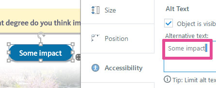
In certain versions of Storyline, it's been found that unique, state-specific alt text may not be recognized by screen readers if a button's normal state alt text is the default button text, as is typically indicated by:
-
In the Size and Position panel's Accessibility tab, the alt text exactly matches the button text and is gray, instead of being black
-
In the Focus Order panel, no alt text is presented for the button

This issue manifests as screen readers announcing the normal state's alt text even when the button is in another state that has unique alt text.
It's been found that this issue can be easily solved by adding a space at the end of the normal state alt text — so that it is customized and does not exactly match the button text — or by customizing the normal state alt text in another way.
For example, in the screenshot below, you can see that a space has been added after the button text that populated the alt text field by default (that space has been highlighted in the screenshot so that it is more visible). Additionally, you can also see in the screenshot that the alt text is now black, instead of being gray, indicating that it is custom alt text.