Electronic Accessibility
Techniques for Conveying Information (Other Than Using Color)
Last updated: 5/23/2025

There are many ways to convey information in tandem with, or instead of, using color.
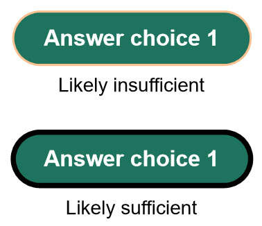
Whichever method you use, just make sure it is reliably pereceivable. For example, you could potentially differentiate a unique button state that's intended to convey information from a normal button state by giving the unique button state an outline, while giving the normal button state no outline, but if you did that, the outline color would likely need to achieve 3:1 contrast and have sufficient width (a.k.a. "thickness," "stroke," and "weight," depending on your development platform) to be considered visible — 3px minimum is commonly recommended.

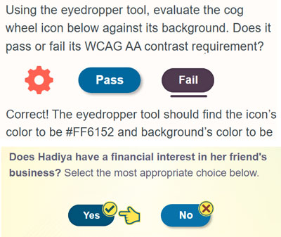
A button outline, button underline, arrow or pointer icon may commonly be understood to represent a selected state, but they might not as readily and intuitively convey other statuses, like visited, correct and incorrect. For these, consider using icons, like a checkmark for correct or visited and an X for incorrect.
And of course, you can always use text labels, in various ways, to convey information. For instance, in the visited status example below, the "Type 2" heading conveys that the Type 2 button is currently selected, while in the button underline example above, the "Correct!" text conveys that the selected "Fail" button was indeed the correct answer choice.
![]()
Additionally, keep in mind that any status or other information conveyed visually needs to be equivalently conveyed to screen reader users, typically via alt text.
