
Electronic Accessibility
Strategies for Presenting Buttons
Last updated: 5/21/2025
When it comes to presenting buttons, often the two most important goals are:
- Ensuring users get accurate information concerning button purpose/function and current status
- Providing the necessary information in a succinct and/or streamlined manner
As an eCourse developer, you'll need to determine the approach that best achieves these goals, and that will often vary button-to-button.
Button text alone

For certain buttons whose function is inherently obvious or sufficiently contextualized by surrounding content, the button text alone may serve to convey all the necessary information. For example, an "Exit Course" button in an eCourse's final slide, especially if accompanied by instructions, likely does not require further contextualization through alt text and could be presented to assistive technology users with that button text alone.
Purpose/function through alt text
In certain situations, it's best to use a button's alt text to convey a more comprehensive sense of a button's function and/or status.
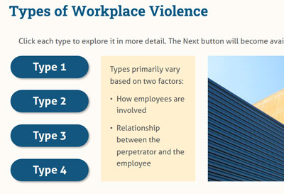
For example, consider buttons with the button text "Type 1," "Type 2," etc. that open layers offering more detailed information on each type. The buttons' text would provide some sense of the buttons' purposes, but "Open Type 1 pop-up" provides screen reader users with a much fuller sense of what the button does, helping them know what behavior to expect — a new layer will open — and what do next — explore the layer then close it — while still being quite succinct.
Function and status through alt text
For buttons that have multiple states and/or statuses, you'll likely need to use the button's alt text to convey both its function and its status. (See Element status in Storyline for an overview of which statuses are programmatically defined within Storyline eCourses and thus don't require alt text.)

For example, you may include an autoplay button in each slide that learners can use to toggle the eCourse between its manual play mode and autoplay mode.
Since eCourse's should start in their manual play mode — as part of being as accessible as possible by default — the button's normal state would represent autoplay being off, so alt text like the following could used:
- "Autoplay toggle; autoplay is off": this conveys purpose — the button toggles the autoplay setting — and current status — "off" — very succinctly
- Note: while screen reader users can control how their screen reader reads punctuation, many screen readers will, by default, read punctuation like commas, periods, semicolons, colons, etc. as pauses of different lengths
- "Toggle autoplay on; autoplay is currently off": this provides a tad more information but correspondingly will take a tad longer for screen reader users to listen through; it's up to you to determine when extra information or clarity is worth that extra time cost or not; though, you can incorporate other strategies for minimizing that cost — for instance, this version of the alt text subtly merges purpose and status before the semicolon, since "Toggle autoplay on" implies autoplay is off, so even though you might still include "autoplay is currently off" after the semicolon, to ensure that information gets across, screen reader users may not feel the need to listen that far
Conversely, the following alt text could be used for the button's selected state, which represents autoplay currently being on, so that clicking the button toggles it off:
- "Autoplay toggle; autoplay is on"
- "Toggle autoplay off; autoplay is currently on"
Labeling buttons and associated components

For many buttons, their function and status will be short enough that it can be captured in alt text without inhibiting the screen reader user experience: for example, using "Select All of these are factors; All of these are factors is currently unselected" as the unselected/normal state alt text for an "All of these are factors" multiple choice answer button.
But in some cases, particularly with buttons used in assessment activities, a button might represent so much information that it's confusing or annoying for screen reader users to have to encounter it in a single element's alt text.
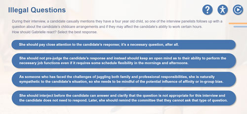
For instance, in this scenario example, most button's answer choice is well over the 150 character limit commonly recommended for alt text. If reading linearly, screen reader users may be confused where one button ends and the next begins or they may be frustrated by such a long string appearing in their list of all the buttons/form fields in the environment. It may be better to offer the answer choice text separately from the button used to select that answer choice.
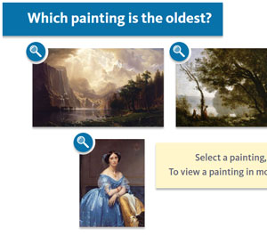
Or, consider this "Which painting is the oldest?" activity example. Each answer choice has at least three components associated with it:
- A description of the painting
- A button to select the painting
- A magnify button to view that painting in more detail: that is, at a larger size in a dedicated pop-up layer
- Note: in order to provide an equivalent experience for magnifying each painting, the painting description provided to screen reader users in the magnify layer provides much more detail than the painting description provided in the slide's base layer
In both these cases, it would be advantageous to label each component in some way so that screen reader users can reliably know with which choice each component is associated.
In the scenario example, the answer choice text might be labeled like so — "Answer choice 4, "She should interject before the candidate can answer and clarify that the question is not appropriate for this interview and the candidate does not need to respond. Later, she should remind the committee that they cannot ask that type of question." — while the answer choice button uses alt text like this: "Select answer choice 4."
In the "Which painting is the oldest?" activity example, since there are so many components associated with each choice, the label was made its own component and programmed as a heading (to help with organization and provide screen reader users with another navigation option) and all the components include that label in some way, like so:
- Label, programmed as a Heading 2: "Painting 1"
- Description: "Painting 1 is a majestic, alpine lake landscape, with golden clouds and jagged mountain peaks "
- Magnify button alt text: "Magnify Painting 1 and open detailed description pop-up"
- Selector button alt text: "Select painting 1, currently unselected"